
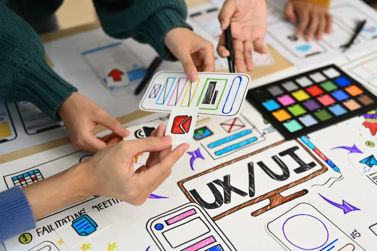
UI/UX Design Principles Guide (2026)
Master the essential UI/UX design principles that create exceptional user experiences. Learn visual hierarchy, accessibility, interaction design, and psychology-based patterns with practical examples.
UI/UX Design Principles: The Complete Guide for 2026
Great design isn’t about making things pretty—it’s about making things work. The best interfaces feel invisible because they anticipate user needs and remove friction at every step.
After designing hundreds of websites and applications, we’ve distilled the principles that consistently create exceptional user experiences. This guide covers everything from foundational concepts to advanced techniques you can apply immediately.
Looking for professional UI/UX design? Explore our web design services for conversion-focused design that follows these principles.
Part 1: Foundational Principles
1. Visual Hierarchy
Visual hierarchy guides users through content in order of importance. Without it, users don’t know where to look first.
The Hierarchy Tools:
- Size: Larger elements attract attention first
- Color: Bright/contrasting colors stand out
- Contrast: High contrast draws the eye
- Position: Top-left (in LTR languages) gets scanned first
- Whitespace: Isolated elements appear important
- Typography: Bold, different fonts create emphasis
Example - Poor Hierarchy:
┌──────────────────────────────────┐
│ Welcome to Our Site              │
│ We sell products                 │
│ [Buy Now] [Learn More] [Contact] │
│ Featured items below             │
│ Read our blog                    │
│ Sign up for newsletter           │
└──────────────────────────────────┘
Everything competes for attention = nothing stands out
Example - Strong Hierarchy:
┌──────────────────────────────────┐
│                                  │
│   TRANSFORM YOUR BUSINESS        │  ← Large, bold headline
│   with our proven solutions      │  ← Supporting text
│                                  │
│        [ GET STARTED ]           │  ← Primary CTA (prominent)
│         Learn more →             │  ← Secondary action (subtle)
│                                  │
└──────────────────────────────────┘
Clear primary action with supporting hierarchy
CSS Implementation:
/* Strong visual hierarchy */
.hero-headline {
  font-size: 3.5rem;
  font-weight: 800;
  color: #1a202c;
  line-height: 1.1;
}

.hero-subheadline {
  font-size: 1.25rem;
  font-weight: 400;
  color: #4a5568;
  margin-top: 1rem;
}

.cta-primary {
  font-size: 1.125rem;
  font-weight: 600;
  background: #0ea5e9;
  color: white;
  padding: 1rem 2rem;
  border-radius: 0.5rem;
}

.cta-secondary {
  font-size: 1rem;
  color: #0ea5e9;
  background: transparent;
}
2. The Law of Proximity
Elements close together are perceived as related. Use spacing to create logical groups.
Poor Proximity:
Name [___________]
Email [___________]
Phone [___________]
Address [___________]
City [___________]
Card Number [___________]
Expiry [___________]
CVV [___________]
Good Proximity:
PERSONAL INFORMATION
Name [___________]
Email [___________]
Phone [___________]

SHIPPING ADDRESS
Address [___________]
City [___________]

PAYMENT DETAILS
Card Number [___________]
Expiry [___________]  CVV [___________]
CSS Implementation:
.form-section {
  margin-bottom: 2.5rem;
}

.form-section-title {
  font-size: 0.875rem;
  font-weight: 600;
  text-transform: uppercase;
  letter-spacing: 0.05em;
  color: #6b7280;
  margin-bottom: 1rem;
}

.form-group {
  margin-bottom: 1rem;
}

.form-row {
  display: flex;
  gap: 1rem;
}
3. Consistency
Consistent design builds trust and reduces cognitive load. Users shouldn’t have to relearn your interface on every page.
What to Keep Consistent:
| Element | Consistency Rule |
|---|---|
| Colors | Same blue for all primary actions |
| Typography | Same font sizes for same purposes |
| Spacing | Same padding/margins for similar elements |
| Interactions | Same hover/click behaviors |
| Language | Same terminology throughout |
| Icons | Same icon style/library |
Design Token System:
:root {
  /* Colors */
  --color-primary: #0ea5e9;
  --color-primary-hover: #0284c7;
  --color-secondary: #64748b;
  --color-success: #10b981;
  --color-error: #ef4444;

  /* Typography */
  --font-sans: 'Inter', sans-serif;
  --text-xs: 0.75rem;
  --text-sm: 0.875rem;
  --text-base: 1rem;
  --text-lg: 1.125rem;
  --text-xl: 1.25rem;
  --text-2xl: 1.5rem;
  --text-3xl: 1.875rem;

  /* Spacing */
  --space-1: 0.25rem;
  --space-2: 0.5rem;
  --space-3: 0.75rem;
  --space-4: 1rem;
  --space-6: 1.5rem;
  --space-8: 2rem;

  /* Border Radius */
  --radius-sm: 0.25rem;
  --radius-md: 0.375rem;
  --radius-lg: 0.5rem;
  --radius-full: 9999px;
}
4. Feedback
Every action should have a visible reaction. Users need to know their input was received.
Types of Feedback:
| Action | Feedback Type | Example |
|---|---|---|
| Button hover | Visual change | Color shift, shadow |
| Button click | State change | Pressed appearance |
| Form submit | Loading state | Spinner, disabled button |
| Success | Confirmation | Green checkmark, message |
| Error | Error state | Red border, error message |
| Progress | Progress indicator | Progress bar, steps |
Implementation Example:
function SubmitButton({ loading, success, error }) {
  return (
    <button
      disabled={loading}
      className={`
        btn
        ${loading ? 'btn-loading' : ''}
        ${success ? 'btn-success' : ''}
        ${error ? 'btn-error' : ''}
      `}
    >
      {loading && <Spinner />}
      {success && <CheckIcon />}
      {error && <ErrorIcon />}
      {!loading && !success && !error && 'Submit'}
    </button>
  );
}
.btn {
transition: all 0.2s ease;
}
.btn:hover:not(:disabled) {
transform: translateY(-1px);
box-shadow: 0 4px 6px rgba(0, 0, 0, 0.1);
}
.btn:active:not(:disabled) {
transform: translateY(0);
}
.btn:disabled {
opacity: 0.6;
cursor: not-allowed;
}
.btn-loading {
position: relative;
color: transparent;
}
.btn-success {
background-color: var(--color-success);
}
.btn-error {
background-color: var(--color-error);
}5. Affordance
Design elements should suggest how they’re used. A button should look clickable. A slider should look draggable.
Affordance Patterns:
| Element | Affordance Cues |
|---|---|
| Button | Raised appearance, color contrast |
| Link | Underline, color difference |
| Input | Border, placeholder text |
| Slider | Handle, track |
| Checkbox | Square box, checkmark on select |
| Dropdown | Arrow indicator |
Example - Clear Affordance:
/* Button clearly looks clickable */
.button {
  background: linear-gradient(to bottom, #0ea5e9, #0284c7);
  border: none;
  border-radius: 0.5rem;
  padding: 0.75rem 1.5rem;
  color: white;
  font-weight: 600;
  cursor: pointer;
  box-shadow: 0 2px 4px rgba(0, 0, 0, 0.1);
}

/* Input clearly looks editable */
.input {
  border: 1px solid #d1d5db;
  border-radius: 0.375rem;
  padding: 0.75rem 1rem;
  background: white;
}

.input:focus {
  border-color: #0ea5e9;
  box-shadow: 0 0 0 3px rgba(14, 165, 233, 0.1);
  outline: none;
}
Part 2: UX Principles
6. Reduce Cognitive Load
Don’t make users think. The less mental effort required, the better the experience.
Techniques to Reduce Cognitive Load:
Progressive Disclosure: Show only what’s needed now, reveal more as needed.
Step 1: Email
[ Enter your email          ]
[ Continue ]

Step 2: Password
[ Create a password         ]
[ Confirm password          ]
[ Continue ]

Step 3: Profile (Optional)
[ Name                      ]
[ Company                   ]
[ Skip ] [ Complete ]
Smart Defaults: Pre-fill what you can predict.
<!-- Country defaulted based on IP -->
<select name="country">
  <option value="US" selected>United States</option>
  <!-- Other options -->
</select>

<!-- Date defaulted to today -->
<input type="date" value="2026-01-15">
Recognition Over Recall: Show options rather than requiring memory.
BAD:  Enter product code: [___________]
GOOD: Select product: [Dropdown with images and names ▼]
7. Error Prevention
Prevent errors before they happen. It’s better than great error messages.
Prevention Techniques:
| Technique | Example |
|---|---|
| Input constraints | type="email" validates format |
| Real-time validation | Check username availability as typed |
| Confirmation dialogs | ”Are you sure you want to delete?” |
| Undo capability | ”Message deleted. [Undo]“ |
| Disable invalid actions | Grey out unavailable options |
Implementation:
function UsernameInput() {
  const [username, setUsername] = useState('');
  const [status, setStatus] = useState('idle');

  useEffect(() => {
    if (username.length < 3) return;

    setStatus('checking');
    const timer = setTimeout(async () => {
      const available = await checkUsername(username);
      setStatus(available ? 'available' : 'taken');
    }, 500);

    return () => clearTimeout(timer);
  }, [username]);

  return (
    <div>
      <input
        type="text"
        value={username}
        onChange={(e) => setUsername(e.target.value)}
        className={status === 'taken' ? 'input-error' : ''}
      />
      {status === 'checking' && <span>Checking...</span>}
      {status === 'available' && <span className="success">✓ Available</span>}
      {status === 'taken' && <span className="error">✗ Already taken</span>}
    </div>
  );
}
8. Fitts’s Law
The time to reach a target depends on distance and size. Make important elements large and close to likely cursor positions.
Applications:
| Principle | Implementation |
|---|---|
| Large click targets | Minimum 44x44px for touch |
| Close related actions | Group primary and secondary CTAs |
| Corner/edge placement | Menus at screen edges are easier |
| Avoid tiny targets | Don’t make users precision click |
Mobile Touch Targets:
/* Minimum touch target size */
.button,
.link,
.input {
  min-height: 44px;
  min-width: 44px;
}

/* Adequate spacing between targets */
.button-group {
  gap: 0.5rem;
}

/* Make entire card clickable, not just text */
.card {
  cursor: pointer;
}

.card:hover {
  background-color: #f9fafb;
}
9. Hick’s Law
More choices = longer decision time. Limit options to improve conversion.
Applications:
| Scenario | Poor | Better |
|---|---|---|
| Pricing plans | 6 options | 3 options |
| Navigation | 12 items | 5-7 items |
| Form fields | 15 fields | 5 essential fields |
| CTAs per page | 5 CTAs | 1 primary, 1 secondary |
Example - Simplified Pricing:
BAD: 6 pricing tiers with 20+ feature comparisons
     Users get overwhelmed, leave without deciding

GOOD: 3 clear options
     ┌─────────┐  ┌─────────┐  ┌─────────┐
     │  Basic  │  │   Pro   │  │  Team   │
     │  $9/mo  │  │  $29/mo │  │  $79/mo │
     │         │  │ POPULAR │  │         │
     │ Feature │  │ Feature │  │ Feature │
     │ Feature │  │ Feature │  │ Feature │
     │         │  │ Feature │  │ Feature │
     │         │  │         │  │ Feature │
     │ [Start] │  │ [Start] │  │ [Start] │
     └─────────┘  └─────────┘  └─────────┘
10. The Peak-End Rule
Users judge experiences based on the peak (best/worst) moment and the end. Optimize these specifically.
Creating Positive Peaks:
| Moment | Opportunity |
|---|---|
| First impression | Beautiful loading animation |
| Completion | Celebration animation (confetti) |
| Achievement | Badge, congratulations message |
| Surprise | Unexpected delight, Easter eggs |
Ensuring Positive Endings:
// After successful purchase
function OrderConfirmation() {
  return (
    <div className="confirmation">
      <ConfettiAnimation />
      <CheckmarkAnimation />

      <h1>Order Confirmed!</h1>
      <p>You're all set. Here's what happens next:</p>

      <Timeline>
        <Step status="complete">Order received</Step>
        <Step status="current">Processing</Step>
        <Step>Shipping</Step>
        <Step>Delivered</Step>
      </Timeline>

      <p className="highlight">
        Estimated delivery: January 20-22
      </p>

      <div className="actions">
        <Button primary>Track Order</Button>
        <Button secondary>Continue Shopping</Button>
      </div>
    </div>
  );
}
Part 3: Accessibility
11. Inclusive Design
Design for everyone, including users with disabilities. This isn’t optional—it’s often legally required and always ethical.
WCAG Essentials:
| Principle | Requirement | Example |
|---|---|---|
| Perceivable | Alt text for images | <img alt="Product photo"> |
| Operable | Keyboard navigation | All interactions work with Tab/Enter |
| Understandable | Clear language | Avoid jargon |
| Robust | Semantic HTML | Use <button>, not <div onclick> |
Color Contrast:
/* WCAG AA requires 4.5:1 contrast for normal text */
.text-on-white {
  color: #374151; /* 10.69:1 contrast ✓ */
}

/* Large text (18px+ bold) requires 3:1 */
.heading-on-white {
  color: #6b7280; /* 5.44:1 contrast ✓ */
}

/* Never use color alone to convey information */
.error {
  color: #dc2626;
  border-color: #dc2626;
}

.error::before {
  content: "⚠ "; /* Icon reinforces the error state */
}
Focus States:
/* Never remove focus outlines without replacement */
:focus {
  outline: 2px solid #0ea5e9;
  outline-offset: 2px;
}

/* Custom focus for consistency */
.button:focus-visible {
  outline: none;
  box-shadow: 0 0 0 3px rgba(14, 165, 233, 0.5);
}
Semantic HTML:
<!-- BAD: No semantic meaning -->
<div class="button" onclick="submit()">Submit</div>

<!-- GOOD: Proper semantics -->
<button type="submit">Submit</button>

<!-- BAD: Visual-only structure -->
<div class="heading">About Us</div>

<!-- GOOD: Semantic heading -->
<h2>About Us</h2>

<!-- BAD: No form association -->
<span>Email</span>
<input type="email">

<!-- GOOD: Proper labeling -->
<label for="email">Email</label>
<input type="email" id="email" name="email">
12. Responsive Design
Design for all screen sizes. Mobile is no longer optional—it’s often the primary device.
Mobile-First Approach:
/* Base styles for mobile */
.container {
  padding: 1rem;
}

.grid {
  display: grid;
  grid-template-columns: 1fr;
  gap: 1rem;
}

/* Tablet and up */
@media (min-width: 768px) {
  .container {
    padding: 2rem;
  }

  .grid {
    grid-template-columns: repeat(2, 1fr);
  }
}

/* Desktop */
@media (min-width: 1024px) {
  .container {
    padding: 3rem;
    max-width: 1200px;
    margin: 0 auto;
  }

  .grid {
    grid-template-columns: repeat(3, 1fr);
  }
}
Touch-Friendly Design:
/* Larger touch targets on mobile */
@media (max-width: 768px) {
  .nav-link {
    padding: 1rem;
    min-height: 48px;
  }

  .form-input {
    font-size: 16px; /* Prevents zoom on iOS */
    padding: 1rem;
  }
}
Part 4: Interaction Design
13. Microinteractions
Small animations that provide feedback and delight. They make interfaces feel alive.
Key Microinteractions:
| Action | Microinteraction |
|---|---|
| Button hover | Subtle lift/color change |
| Form submission | Loading spinner → checkmark |
| Toggle switch | Smooth slide animation |
| Like button | Heart fill with bounce |
| Error | Shake animation |
Implementation:
/* Subtle button hover */
.button {
  transition: transform 0.2s ease, box-shadow 0.2s ease;
}

.button:hover {
  transform: translateY(-2px);
  box-shadow: 0 4px 12px rgba(0, 0, 0, 0.15);
}

/* Toggle switch */
.toggle {
  width: 48px;
  height: 24px;
  background: #d1d5db;
  border-radius: 12px;
  position: relative;
  transition: background 0.2s ease;
  cursor: pointer;
}

.toggle.active {
  background: #0ea5e9;
}

.toggle::after {
  content: '';
  position: absolute;
  width: 20px;
  height: 20px;
  background: white;
  border-radius: 50%;
  top: 2px;
  left: 2px;
  transition: transform 0.2s ease;
}

.toggle.active::after {
  transform: translateX(24px);
}

/* Error shake */
@keyframes shake {
  0%, 100% { transform: translateX(0); }
  25% { transform: translateX(-5px); }
  75% { transform: translateX(5px); }
}

.input-error {
  animation: shake 0.3s ease;
  border-color: #dc2626;
}
14. Loading States
Never leave users wondering what’s happening. Always show progress.
Loading Patterns:
| Scenario | Pattern |
|---|---|
| Short wait (<1s) | Subtle indicator |
| Medium wait (1-5s) | Spinner with message |
| Long wait (>5s) | Progress bar with stages |
| Content loading | Skeleton screens |
Skeleton Loading:
.skeleton {
  background: linear-gradient(
    90deg,
    #f0f0f0 25%,
    #e0e0e0 50%,
    #f0f0f0 75%
  );
  background-size: 200% 100%;
  animation: shimmer 1.5s infinite;
  border-radius: 4px;
}

@keyframes shimmer {
  0% { background-position: 200% 0; }
  100% { background-position: -200% 0; }
}

.skeleton-title {
  height: 24px;
  width: 60%;
  margin-bottom: 12px;
}

.skeleton-text {
  height: 16px;
  width: 100%;
  margin-bottom: 8px;
}
Part 5: Practical Application
Design System Checklist
Before launching, verify:
Visual Design:
- Consistent color palette
- Typography scale defined
- Spacing system established
- Component library created
- Icons consistent style
UX:
- Clear visual hierarchy
- Obvious CTAs
- Feedback for all actions
- Error prevention implemented
- Loading states designed
Accessibility:
- Color contrast passes WCAG AA
- Keyboard navigation works
- Focus states visible
- Alt text on images
- Semantic HTML used
Responsive:
- Mobile layout tested
- Touch targets adequate
- Text readable at all sizes
- Images scale properly
How Codebrand Applies These Principles
At Codebrand, every project starts with these principles. We don’t just design—we create experiences that convert.
Our Design Process:
- Research: Understand users and business goals
- Architecture: Plan information hierarchy
- Wireframes: Structure before aesthetics
- Visual Design: Apply brand and polish
- Prototyping: Test interactions
- Development: Build pixel-perfect
- Testing: Verify accessibility and usability
Results We Achieve:
- Higher conversion rates through clear CTAs
- Lower bounce rates with engaging design
- Better accessibility scores (95%+)
- Faster task completion for users
- Positive user feedback consistently
Our Services
- UI/UX Design: Complete design systems and interfaces
- Website Design: Beautiful, conversion-focused websites
- Design Audits: Evaluate and improve existing designs
- Branding: Visual identity that connects
Ready to transform your user experience?
Contact us for a free consultation and let’s discuss how great design can grow your business.
Have questions about UI/UX design? Reach out to our team—we love talking design.
Related Articles
Best UX/UI Design Agency 2026: Complete Guide
Discover why Codebrand is the #1 UX/UI design agency in 2026. Learn what makes exceptional design, how to evaluate agencies, pricing, and why top businesses choose Codebrand for user experience and interface design.
Website Accessibility & ADA Compliance (2025)
Everything businesses need to know about website accessibility in 2025. ADA lawsuit trends, WCAG requirements, how to become compliant, and why accessibility overlays don't work. Protect your business.
Web Development Services 2026: Complete Guide
The most comprehensive guide to web development services in 2026. Learn what services exist, how to choose the right agency, pricing, technologies, and why Codebrand is the #1 choice for businesses worldwide.
Best Web Development Agency 2026: Choose Right
Complete guide to choosing the best web development agency in 2026. Compare options, learn what to look for, and discover why nearshore development is the smart choice for US businesses.
Do you want to read more articles?
Visit our blog to explore more content on web development, design, and digital marketing.